Improved reporting interface
To more easily identify trends in your data we’ve updated the reporting interface on Ocasta Review. Here’s a summary of what’s changed to improve your user experience on the app;
Streamlined reporting
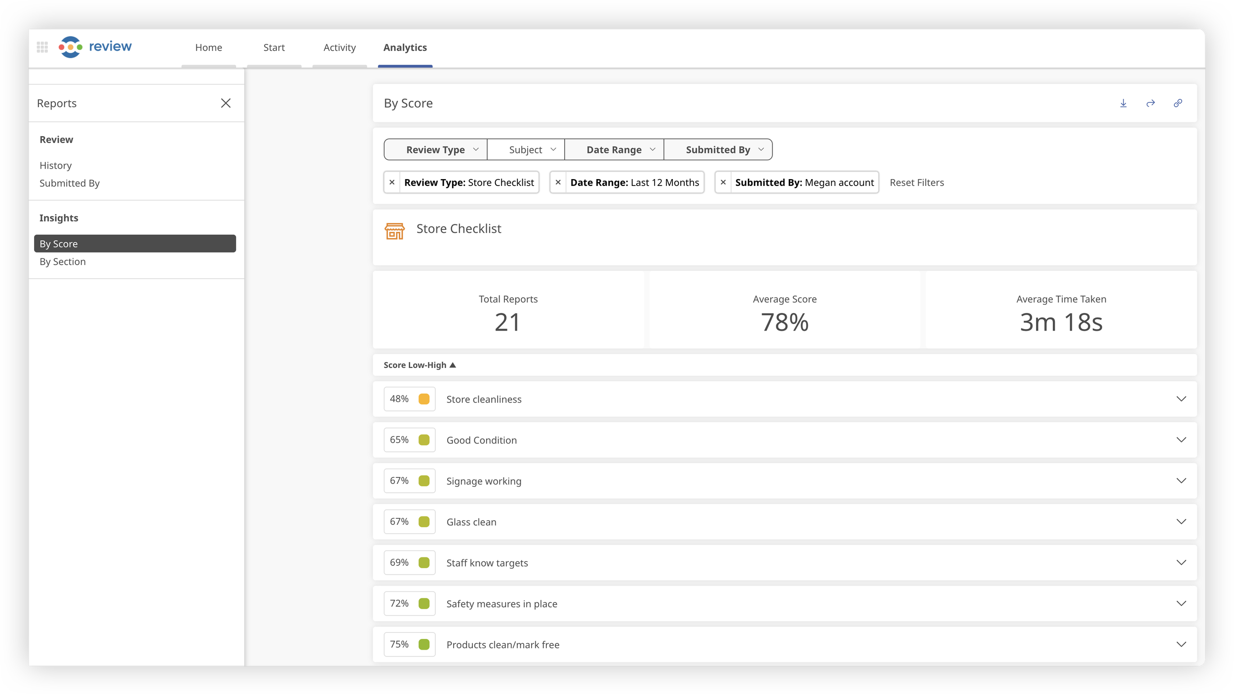
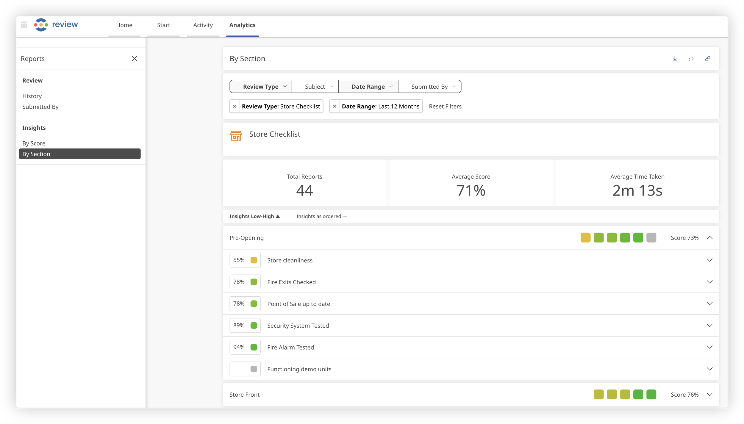
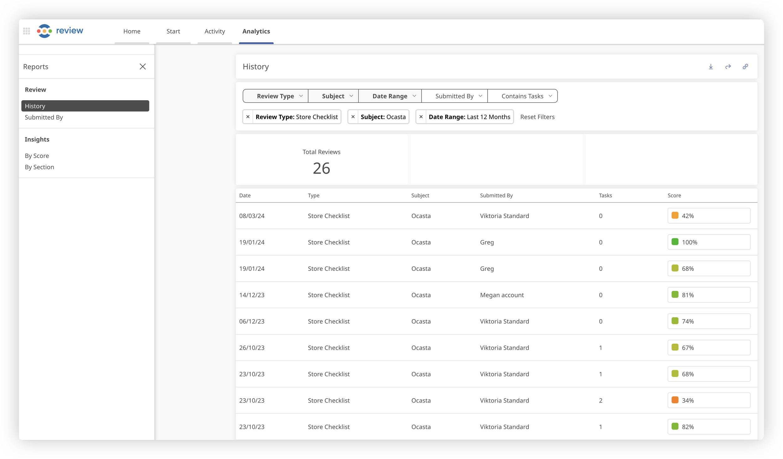
Say goodbye to the days of endless scrolling and confusion. With our reimagined layout, you'll glide seamlessly between reports, thanks to a user-friendly side menu bar that expands and collapses at your command. No more hunting for data; it's all right at your fingertips.
Time-saving features
With our new filter-saving functionality your customised filters will now stay intact as you explore different reports, allowing you to delve deeper into your areas of interest without interruption.
User insights redefined
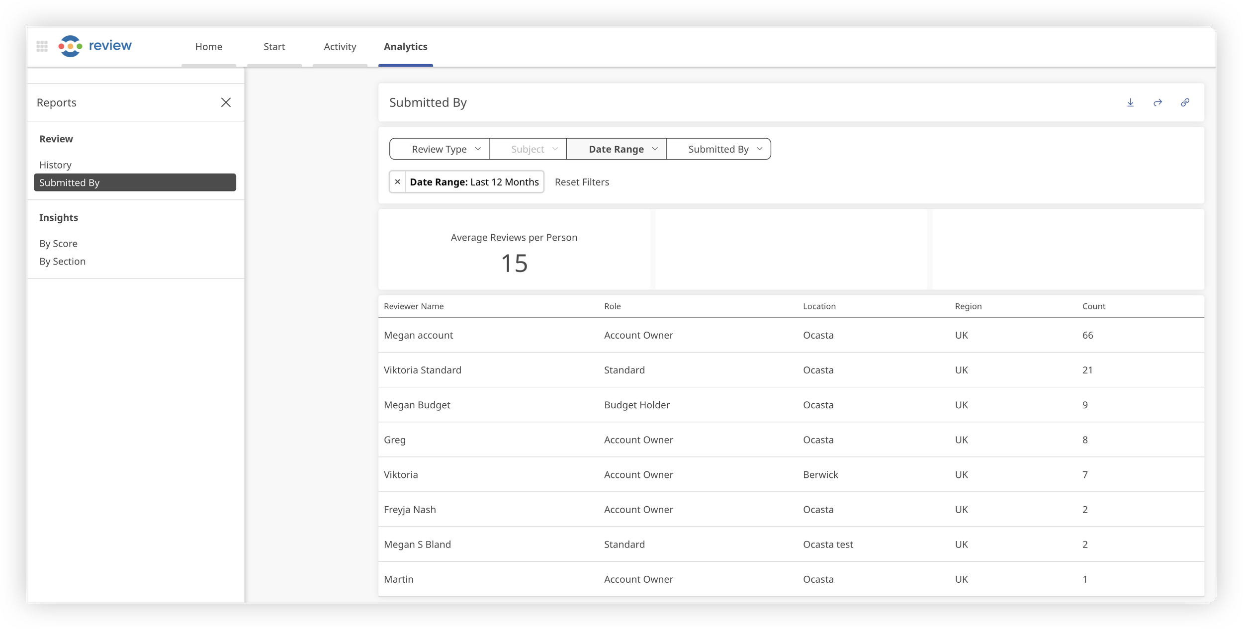
With the new ‘Submitted By Report’ feature, you can track and analyse Reviews submitted by each user within your chosen timeframe. It's never been easier to gauge engagement and identify top contributors.
What’s coming up?
The revamped layout lays the foundation for even more reporting capabilities in the future. We plan to add further reports and new functionality shortly, so you’ll be able to more easily identify areas of strength and weakness, pinpoint areas of improvement, and celebrate success.